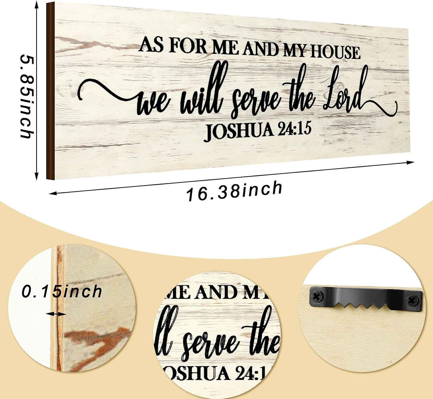
There is a specific fear that almost every faith-motivated home decorator has felt at least once: standing back from a newly hung scripture print and thinking, this looks like it belongs in a fellowship hall, not my living room. The sentiment is real. Scripture wall art — meaning any framed, mounted, or printed piece that displays a Bible verse or faith phrase as the visual centerpiece — spans an enormous range in quality, style, and emotional register. At one end sit mass-produced canvas prints with clip-art doves and a font your local church newsletter also uses. At the other end are hand-lettered giclée prints (a museum-quality ink process that faithfully reproduces brushstroke texture) and letterpress pieces (where the design is physically pressed into thick paper with a relief plate, leaving a tactile impression you can feel with your fingertip). This guide will help you navigate that full range — knowing what to spend, what to look for, and how to make scripture feel like yours on the wall rather than décor borrowed from a Sunday school classroom.
Why Scripture Wall Art Goes Wrong — and How to Avoid It
The most common mistake isn’t choosing the wrong verse. It’s choosing the wrong treatment of the verse. Apartment Therapy’s roundup of modern religious décor notes that pieces tend to read as institutional when three things converge: a novelty font, a stock illustration, and a substrate (the material the art is printed on) that has no visual weight of its own. Think thin canvas pulled over a cheap frame, printed with a script so ornate it takes four seconds to read the actual words.
The fix is simpler than it sounds: separate the verse from the visual style, and then decide which one you want to lead.
Verse-forward pieces are about the words. The typography (font choice, sizing, spacing) is the art. When done well — clean sans-serif or a restrained hand-lettered style on quality paper — these can look as current as anything from a design-forward home goods store. When done poorly, the words compete with themselves.
Image-forward pieces use the scripture as a caption or complement to a painting, photograph, or illustration. These tend to integrate more naturally into a gallery wall because the eye has more than one place to rest.
Christianity Today’s coverage of the faith-and-visual-culture movement points out that many Christian artists working today are deliberately pushing back against the “bulletin board aesthetic” — investing in materials, printing methods, and design restraint that would be at home in a secular gallery. That shift has real implications for what’s available at every price point right now.
The Price Tiers — and What You Actually Get at Each
By the numbers
| Tier | Typical price range | What changes |
|---|---|---|
| Entry | $14–$45 | Mass-printed canvas or paper; clip-art flourishes common |
| Mid | $50–$120 | Giclée on fine art paper; independent artist; limited run |
| Premium | $130–$280+ | Letterpress, hand-lettered original, or archival-framed giclée |
Entry tier ($14–$45): This is the world of big-box home goods and marketplace mass-production. The print itself may look fine in a product photo, but reviewers across aggregated home décor forums consistently note that the colors shift when the piece is hung in natural light, and the frames (if included) tend to show stress at the corners within a year. For a child’s bedroom, a dorm room, or a short-season gift, this tier is perfectly appropriate. For a living room focal point or a milestone gift meant to last decades, it usually falls short on craftsmanship.
Mid tier ($50–$120): This is where independent Christian artists — many operating through their own studio sites or through curated gift platforms — are doing their most interesting work. Giclée printing on 100% cotton rag paper or heavyweight archival paper means the piece will not yellow or fade for decades under normal indoor light. Good Housekeeping’s wall art buying guide identifies archival paper weight (usually 230–310 GSM, a paper thickness measure) and pigment-based ink as the two non-negotiable markers of a print worth keeping long-term. At this tier you’re paying for materials and a real artist’s design sensibility, not just a verse dropped into a template.
Premium tier ($130–$280+): Letterpress is the clearest marker here. Because each letterpress run requires hand-setup of the press plates and uses thick cotton paper to absorb the impression, production quantities stay small and per-unit cost stays high. Relevant Magazine’s piece on faith-motivated home décor describes letterpress scripture prints as “objects you keep,” distinguishing them from prints you rotate. Hand-lettered originals (ink or watercolor on paper, one-of-a-kind) occupy the same emotional register — these are heirloom pieces, not seasonal décor. At this tier, framing matters as much as the print: museum glass (which filters UV light and eliminates glare without the distortion of non-glare coatings) and acid-free matting extend the life of the piece and signal to anyone looking at it that the work is meant to be taken seriously.
Matching Style to Space — the Decision That Most Guides Skip
Most buying guides tell you what to spend. Fewer tell you how to decide what style actually fits your home, which is often where the bulletin-board problem originates. Here’s a practical framework:
Read your existing furniture first. If your living room runs toward warm wood tones, linen upholstery, and collected-over-time objects, you want a print that breathes the same way — probably a warm-toned hand-lettered piece with generous white space, or a letterpress print on cream stock. If your space is clean-lined and modern with cooler tones, a verse set in a minimal sans-serif on white archival paper will integrate far better than anything with flourishes or gold foil.
Consider scale honestly. A 5×7 print above a sofa reads as an afterthought. A 24×36 over a small hallway console reads as anxious. Apartment Therapy’s décor editors consistently recommend that scripture art intended as a room’s focal piece should occupy at least one-third of the visual width of the wall or furniture beneath it. For gallery walls, mix sizes intentionally rather than accidentally.
Match emotional register to room function. A verse about rest (Psalm 23, Matthew 11:28) belongs in a bedroom or reading nook. A verse about abundance or hospitality (Romans 15:7, Proverbs 31) reads naturally in a kitchen or dining room. This sounds obvious until you’re standing in front of a display of prints and grabbing the one with the nicest color scheme — which is how a verse about spiritual warfare ends up over the breakfast table.
Denomination and Audience Considerations
Not every verse or artistic treatment reads the same across faith traditions, and this matters especially when you’re buying for someone else’s home.
Protestant (nondenominational to evangelical): The broadest stylistic range is welcome here. Modern hand-lettering, bold typography, abstract watercolor backgrounds — all land well. Verse references (book, chapter, verse) are typically included and expected.
Catholic homes: Imagery of Mary, the Sacred Heart, or patron saints is common and appropriate, but verse-forward typography pieces are equally welcome. If you’re unsure, a verse from the Psalms or the Gospels in a classic presentation — think giclée on warm paper, simple gold frame — is the safest and most beautiful choice.
Liturgical traditions (Episcopal, Lutheran, Methodist): These traditions tend to respond well to art that has visual gravitas — restrained color palettes, classical typography, or work that echoes illuminated manuscript aesthetics. Anything that reads as overtly commercial or “inspirational poster” in style may feel out of register.
Gifting to someone whose tradition you don’t know: Choose a verse from the Psalms or the Gospels. Choose a neutral artistic style — clean lettering, no denominational symbols. Frame it or present it framed; it signals that you took the gift seriously.
Three Scenarios — and the Right Call for Each
Scenario 1: You want one statement piece for a main living area, and you’re willing to spend up to $150. Look for a giclée print from an independent Christian artist on 300 GSM or heavier cotton paper. Prioritize a design where the verse is legible from across the room, not decorative to the point of illegibility. Have it framed locally with acid-free matting and standard glass at minimum, museum glass if budget allows. The total investment (print plus framing) will likely land at $100–$180 and will look better than a pre-framed $45 piece from a big-box chain every single time, per the design principles Good Housekeeping’s guide lays out for long-term art display.
Scenario 2: You’re buying a milestone gift — a wedding, a house blessing, a 25th anniversary — and the budget is $200–$350. This is the scenario where letterpress earns every dollar. A letterpress scripture print from an independent Christian printmaker, framed with museum glass and presented in archival packaging, is an object the recipient will keep for the rest of their life. Look for studios that print in runs of 50 or fewer and use 100% cotton paper. The rarity and craft process are part of the gift’s meaning — and worth communicating in a note that explains what letterpress is, so the recipient understands what they’re holding.
Scenario 3: You need something meaningful for a child’s room, a dorm, or a temporary space, and the budget is under $40. Don’t overcomplicate it. A clean, well-designed mass-market canvas print with a verse the child or young person actually loves is exactly right for this context. Save the letterpress for the moment when the space — and the milestone — call for permanence. The goal is always matching the emotional weight of the occasion to the craftsmanship level of the gift. A dorm room Psalm 46:10 print on canvas is a perfectly faithful choice. A rushed letterpress piece for a guest bedroom that’s about to be repainted is not the best use of $200.
Scripture on the walls of a home is one of the oldest expressions of faith in the domestic tradition — from mezuzot on doorposts to the samplers stitched by American families in the 1800s. The bulletin-board problem isn’t a failure of faith; it’s a mismatch between intention and craft. Solve for the craft, match the price to the occasion, and the intention takes care of itself.